Walking into a clubhouse last Tuesday in the USA changed my perspective entirely. The sea of baggy pleated khakis is completely gone. Today players wear heavy 500GSM cotton and retro typographic logos. Pastel colorways rule the fairways now. Three months ago I threw away my old wardrobe. I started saving dozens of pins from independent designers. You will see how modern golf branding completely rewrites old rules. These fresh companies merge streetwear functionality with vintage country club appeal. The visual shift feels staggering. A plain white athletic shirt no longer cuts it. People want rich texture and pure attitude. A simple cup logo completely changes the entire vibe of an outfit. I spent weeks tracking down the absolute best labels. You will see exactly what makes them so popular.
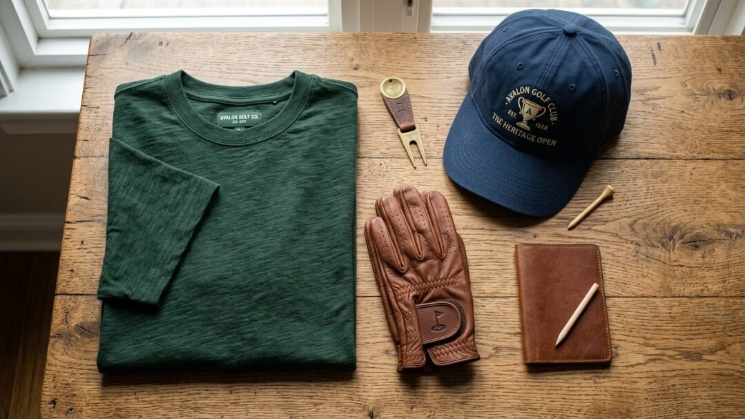
You will walk away with exact styling blueprints for the top golf labels dominating visual platforms right now. We cover exact pricing and material quality for massive names like Malbon and Bogey Boys. You get direct comparisons of fit and fabric. This saves you hundreds of dollars in trial and error. I detail the specific golf design elements making these garments pop in photos. You will see why a simple custom emblem commands premium prices. We review real world durability under tough weather conditions. This deep dive guarantees your next fairway outfit grabs immediate attention. You will know exactly what to buy. You will know exactly how to style it. Your entire wardrobe will look incredibly sharp.
Why Golf Branding Design Dominates Visual Search Platforms
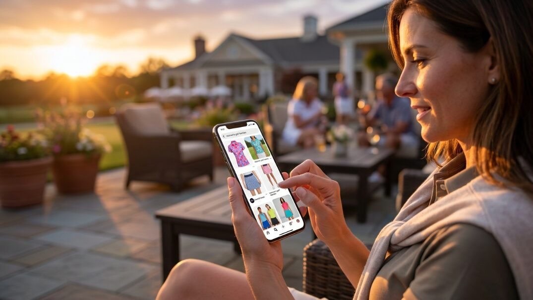
The shift from pure athletic wear to lifestyle apparel happened almost overnight. I watched massive legacy companies scramble. Independent labels captured the Pinterest audience immediately. Visual curation favors bold typography over subtle performance fabrics. People pin entire outfits before they even book a tee time. They want a specific look. They want a specific feeling. A mood board sets the tone for the whole season.
The Shift from Pure Athletic Wear to Visual Identity
Golf graphic design relies entirely on aesthetic cohesion. The best companies treat a cotton polo like a blank canvas. When I tested the Bogey Boys spring line last year I felt amazed. The attention to retro detailing blew my mind completely. They use a custom 1970s golf logo. This instantly separates them from mass market competitors. People gladly pay $150 for a shirt. The typography looks absolutely incredible on camera. A flat athletic shirt provides zero visual texture. A heavy woven shirt provides deep shadows and crisp lines. This makes the photo look extremely expensive. You look perfectly styled for the fairway.
How Golf Prints Command Immediate Attention
Heavyweight fabrics hold shape better in photography. Flimsy polyester wrinkles and reflects harsh light. A quality brand uses structured collars and precise golf branding design. I specifically look for embroidered patches. Cheap screen prints crack and fade quickly. The tactile nature of thick embroidery photographs beautifully. High resolution smartphone cameras pick up every single thread. You see the quality instantly. This drives heavy social media engagement. People ask where you bought the shirt. They want that exact texture. They want that exact fit. They want to replicate the vibe perfectly.
Malbon Golf Streetwear Meets Traditional Golf Design
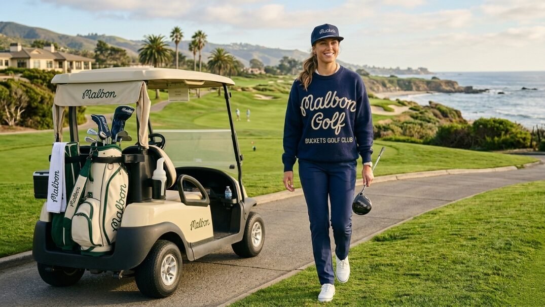
Malbon single handedly altered the entire apparel market. They moved the sport away from rigid dress codes. They introduced relaxed skate inspired silhouettes. Every time I wear my Malbon script sweater someone asks where I bought it. The drape feels incredibly loose and comfortable. They blend urban culture with fairway traditions perfectly.
Deconstructing the Script Logo Magic
The handwritten Malbon golf logo creates instant recognition everywhere. It feels completely casual. It rejects the stiff corporate crests of the past. Their recent drops feature bold color blocking and oversized fits. You pay around $140 for a standard polo. The heavy fabric completely justifies the price tag. As of May 2026 their resell market value remains incredibly high. People hunt for sold out pieces daily. The golf branding feels exclusive but very welcoming. You feel like part of a massive secret club.
Styling the Pieces for a Cohesive Golf Brand Look
You cannot mix Malbon with standard tight athletic gear. The clash of relaxed silhouettes with tight performance pants looks terrible. I pair their baggy pleated trousers with flat brimmed caps. The complete aesthetic requires absolute commitment to the relaxed fit. The golf branding relies on this specific attitude.
- Pair an oversized sweater with relaxed khaki trousers.
- Wear chunky skate style shoes to finish the look.
- Keep accessories strictly minimal.
The entire outfit flows naturally. You look like you just left a local coffee shop.
Bogey Boys Mastering the 1970s Retro Vibe
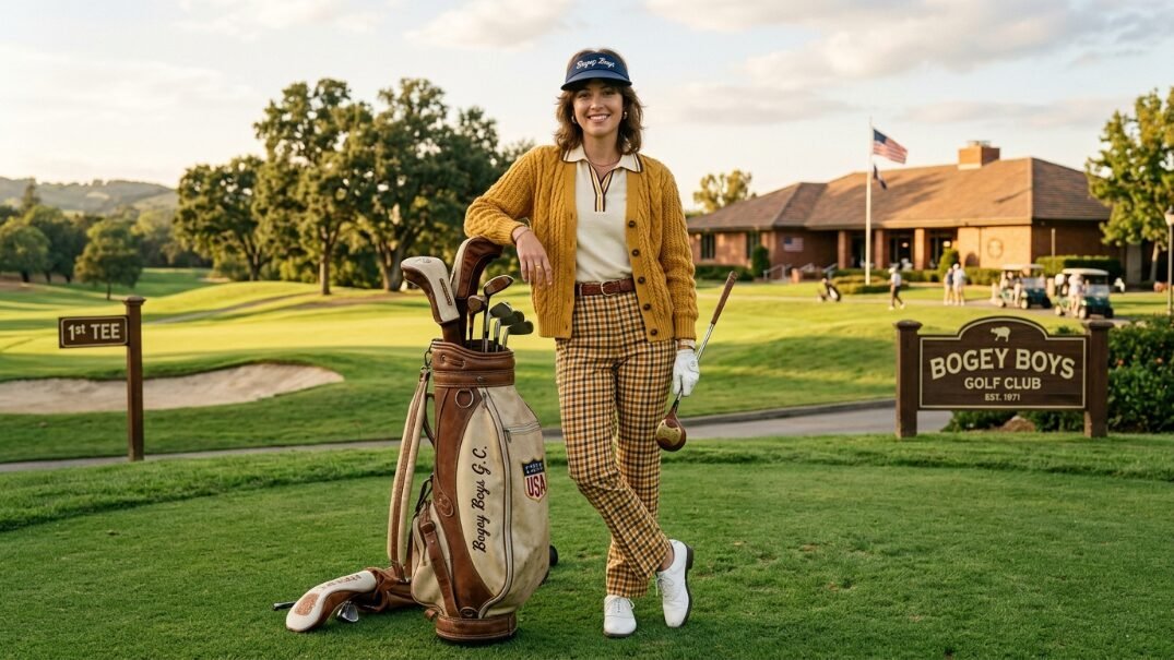
Macklemore founded Bogey Boys out of pure frustration. He hated boring athletic wear. He nailed the 1970s aesthetic perfectly. I wore their leopard print polo last week. I felt like a retro movie star. The fabric felt incredible against my skin. They capture pure nostalgia beautifully.
Vintage Country Club Meets Modern Silhouette
The brand utilizes deep greens and mustard yellows. Their golf prints feature argyle patterns and classic thick stripes. The tailoring remains extremely sharp. They avoid the sloppy look of actual thrift store clothes. I bought their classic knit polo last week. The fit hugs the arms perfectly. The waist tapers cleanly without bagging. You get authentic retro golf design easily. The clothes smell fresh and fit perfectly. The heavy cotton drapes beautifully across your shoulders. I wore it to a private club yesterday. Three members asked me about the brand immediately.
The Art of the Cup Logo in Modern Merchandising
Bogey Boys uses a crossed club and cup logo. This perfectly mimics heritage crests from old clubs. This golf branding design gives the clothes instant historical weight. They apply this crest to heavy cardigans. This creates the ultimate grandfather chic vibe. It photographs perfectly against manicured green grass. The logo sits right over the heart. The embroidery feels incredibly dense. You feel a sense of absolute luxury. The thick stitching catches the light perfectly.
G FORE Bold Color Palettes and Disruptive Ideals
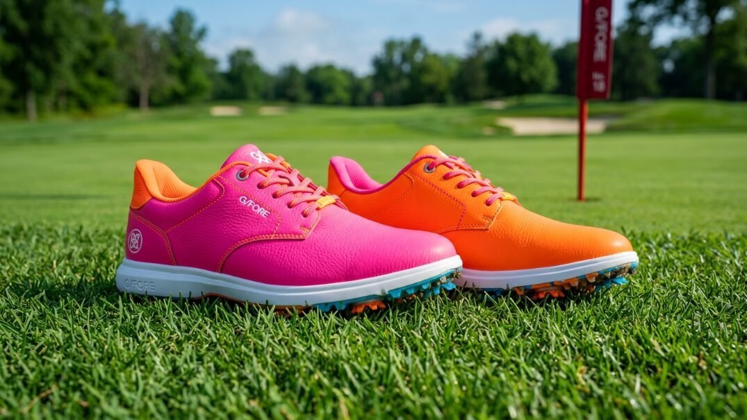
G FORE does nothing quietly. Their shoes and gloves feature shocking neon accents. I tested their signature Gallivanter shoes recently. The comfort perfectly matches the wild styling. They refuse to play it safe. Their designs demand absolute attention on every hole.
Premium Materials and Minimalist Typography
They offset their loud colors with very clean golf graphic design. The skull and tees logo provides a slightly rebellious edge. They charge $225 for shoes. They deliver incredible leather quality for that price. The internal massage nubs in the soles actually work beautifully. I walked 18 holes yesterday without a single blister. The premium construction supports the loud visuals perfectly. You never feel like you bought a cheap novelty item. The craftsmanship rivals high end luxury fashion houses perfectly.
Transitioning from Fairway to Everyday Street Style
The apparel easily works at a high end restaurant after your round. The tailored fits resemble luxury streetwear more than athletic gear. These aesthetic golf brands push boundaries while respecting the physical demands of the swing. Their stretchy fabrics allow full rotation without losing shape.
- Wear their neon gloves with an all black outfit.
- Pair their bright shoes with muted khaki pants.
- Let one bright accessory anchor the entire look.
Their golf branding design feels incredibly intentional. You look polished but slightly dangerous.
Eastside Golf Cultural Relevance Through Bold Typography
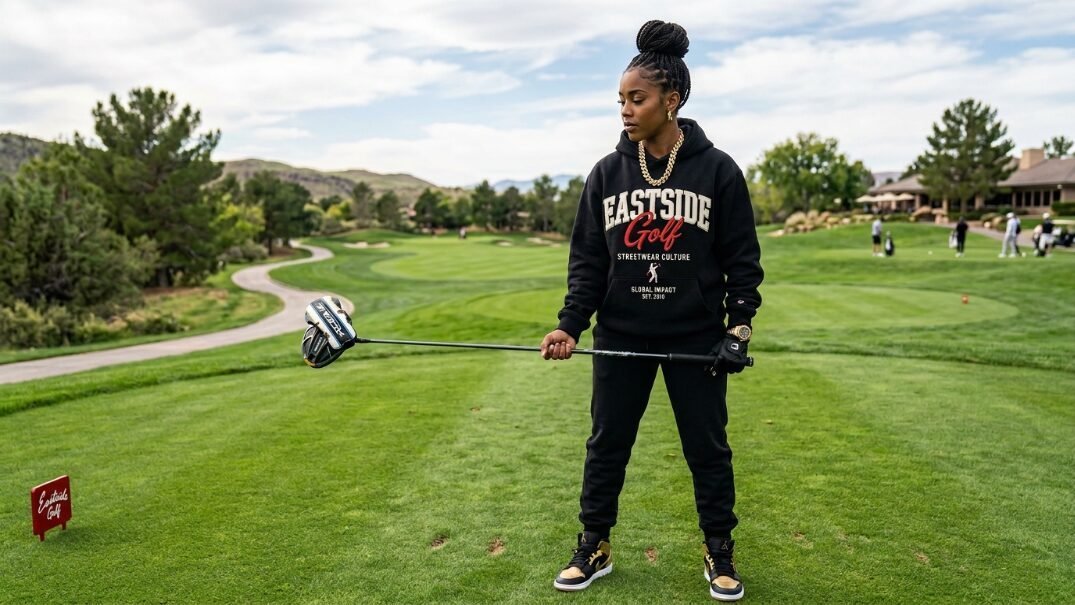
Eastside Golf completely rewrote the demographic playbook. They introduced heavy streetwear influences and urban culture to a historically exclusive sport. I constantly see their items pinned across luxury lifestyle boards. They completely changed who gets to look cool on a course.
The Power of Iconography in Golf Branding Design
Their main golf logo features a Black golfer swinging a club. The character wears jeans and a thick gold chain. This single graphic challenged every outdated dress code at once. The imagery commands absolute respect. Sweatshirts retail around $130 and sell out in hours. The cultural weight behind the brand justifies every penny. I bought their heavy fleece hoodie last winter. The fabric feels thicker than my best winter coats. The graphic embroidery stays perfectly flat after washing.
Building Community Beyond the 18th Hole
Eastside apparel serves as a very clear cultural identifier. When I see someone wearing their gear we instantly share mutual respect. Their golf branding design prioritizes heavy cotton and thick embroidery. They collaborate constantly with massive sneaker companies. This bridges the gap between sneakerheads and players perfectly.
- They use thick cotton that blocks heavy wind.
- Their hoods sit perfectly flat against your back.
- The drawstrings feature heavy metal tips.
This level of detail makes the brand feel incredibly premium. You wear their clothes with immense pride.
Byrdie Golf Social Wear The Ultimate Women Vintage Aesthetic
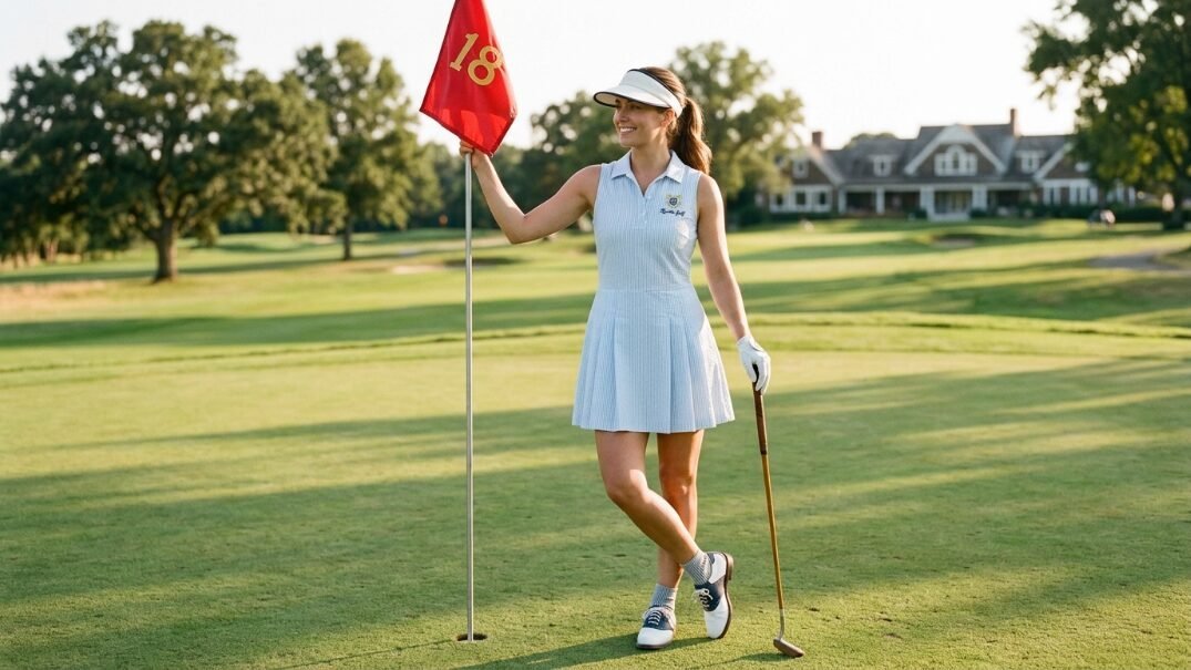
Women apparel suffered from lazy design for decades. Byrdie Golf Social Wear changed everything entirely. They bring a sophisticated preppy aesthetic that completely dominates Pinterest feeds. They make clothes for women who actually love high fashion.
Pastel Hues and Heritage Golf Prints
They utilize seersucker fabrics and gingham golf prints. They finish edges with beautiful scalloped cuts. A friend of mine exclusively wears their dresses on the course. The garments look like they belong in a 1960s Slim Aarons photograph. You will spend around $160 for a dress. The detailing feels impeccable. The lightweight fabrics handle summer heat perfectly. The pastel colors pop beautifully against green grass. The aesthetic feels incredibly expensive and highly curated.
Creating the Perfect Pinterest Golf Capsule
Byrdie pieces mix and match seamlessly. Their high waisted shorts pair beautifully with their crisp white blouses. This creates a cohesive highly photogenic aesthetic. The subtle cup logo embroidery adds just enough athletic context. You can transition from a morning round directly to a country club lunch. You never need to change clothes.
- Match a pastel visor with a gingham skirt.
- Layer a white cardigan over a seersucker dress.
- Wear minimal white leather shoes to finish it.
The entire collection feels completely timeless.
Manors Golf British Heritage with a Modern Cut
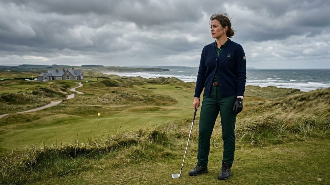
Manors Golf ignores the loud neon crazes completely. They look backward at deep British heritage. Their mood boards feature moody overcast Scottish links courses and heavy knitwear. They capture the pure soul of the game beautifully.
Heavy Knitwear and Muted Tones
I bought their classic knitted cardigan last winter. The pure merino wool feels incredibly luxurious. Their color palette relies entirely on navy blue and forest green. The golf brand focuses on classic tailoring rather than flashy graphics. A sweater will cost you $180. It delivers genuine warmth in brutal weather. The heavy wool drapes perfectly. It makes you look broader and sharper. The rich dark colors hide dirt perfectly during muddy winter rounds.
Minimalist Golf Branding
Their golf logo design features tiny tasteful crests. They let the fabric quality speak for itself. When you wear Manors you look like you belong at St Andrews in 1955. The tailored trousers fit snugly. They feature hidden elastic waistbands. You get pure vintage styling with modern athletic comfort.
- Pair a heavy navy cardigan with charcoal trousers.
- Wear a tweed flat cap instead of a baseball hat.
- Keep all colors dark and earthy.
The aesthetic feels mature and deeply respectful of history.
Metalwood Studio Nostalgic 1990s Vibes
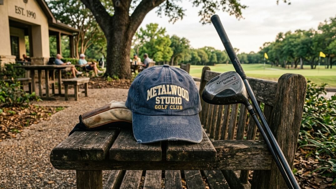
If you grew up watching the game in the late 1990s Metalwood Studio speaks directly to you. They celebrate chunky woods and baggy polo shirts. They capture pure nostalgia perfectly. The aesthetic feels incredibly relaxed and slightly messy.
The Return of the Dad Hat
Their unstructured faded hats dominate the accessories market today. The golf graphic design relies on blocky retro fonts. I own three of their snapbacks because the fit feels perfectly deep. They retail for $45 and constantly sell out. The faded wash makes the items look ten years old immediately. The brim comes perfectly curved right out of the box. You look like a local course legend immediately.
Celebrating Retro Equipment in Apparel
Their golf prints often feature illustrations of old oversized drivers. The golf branding design captures a very specific era of the sport perfectly. The aesthetic completely rejects the polished slim fit era.
- Wear their faded hats with baggy tee shirts.
- Pair vintage sneakers with their relaxed shorts.
- Keep the attitude completely casual.
You look incredibly cool without trying hard at all. The clothes feel like old favorites immediately.
Students Golf Skate Culture on the Putting Green
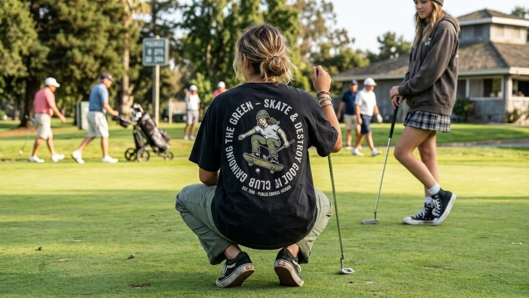
Students Golf treats the course exactly like a skate park. Their aesthetic pulls heavily from independent skateboarding labels from the early 2000s. They bring a rebellious punk energy to very quiet country clubs.
Graphic Heavy Apparel
They use large provocative graphics on the back of their shirts. A standard tee runs $40 and uses incredibly thick cotton. The golf branding often parodies classic corporate logos playfully. I find their approach incredibly refreshing. It reminds everyone not to take the game so seriously. The thick ink printing feels heavy on your back. It reminds you of buying band merchandise at a concert. The clothes carry massive attitude.
Breaking Traditional Rules
You will not find classic thin polo shirts here. They focus on chore jackets and heavy hoodies. The golf brand speaks directly to the weekend player. This player carries a few clubs and drinks beer with friends. Their social feeds look exactly like a vintage skate magazine.
- Wear their heavy chore jacket over a white tee.
- Pair it with loose canvas pants.
- Top it with a bright graphic beanie.
The look screams pure independence and fun.
Radmor The Sustainable Aesthetic

Radmor proves that eco friendly clothing does not have to look terrible. They create incredibly soft gear using sustainable cellulose fibers. They completely eliminate virgin plastic from their supply chain. The visual result feels incredibly premium and soft.
Clean Lines and Earth Tones
Their aesthetic leans very preppy but remains highly modern. The golf graphic design uses simple repeating patterns. I played a round in their Peruvian Pima cotton polo recently. It felt softer than pure silk. The shirts cost $110 and last through hundreds of wash cycles. They refuse to use virgin polyester in any garments. The earth tones look beautifully natural under bright sunlight. The fabric breathes perfectly during humid summer afternoons.
The Subtle Golf Logo
Radmor uses a tiny minimalist leaf icon. The golf branding design remains extremely quiet. They let the drape of the fabric do all the talking. Pinterest users love their muted earthy color palettes. The clothes look naturally weathered and incredibly inviting.
- Pair a sage green polo with light khaki shorts.
- Wear an unstructured canvas hat.
- Keep the whole outfit light and airy.
The aesthetic feels incredibly peaceful and highly refined.
Holderness And Bourne Refined Premium Polo Perfection
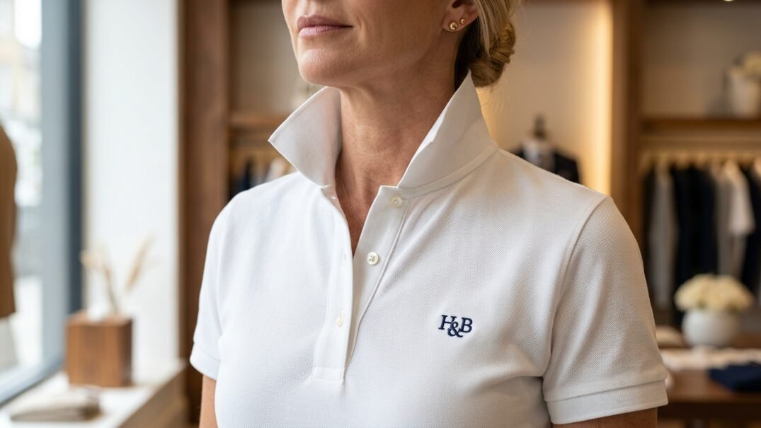
I bought their classic polo three months ago. The tailored fit completely changed my expectations for standard shirts. They deliver absolute perfection for the high end country club aesthetic. The tailoring feels completely custom.
The Stiff Collar Revolution
They use a proprietary hidden collar stay system. Most polo collars curl up after two washes. These collars stay razor sharp forever. You pay $110 for a shirt. The garment looks immaculate in every single photograph. The collar frames your face perfectly. It looks exactly like a freshly ironed dress shirt. This small detail elevates the entire outfit massively. You look sharp from the first tee to the final putt.
Upscale Country Club Visuals
Their Pinterest feed looks exactly like old money. The golf branding uses an extremely subtle monogram.
- The fit remains trim but never restrictive.
- The colors lean toward classic navy and white.
- The fabric features an incredibly tight premium weave.
You wear this brand when you play at extremely exclusive clubs. You look wealthy and highly respectful of tradition.
Quiet Golf The Contemporary Minimalist Dream
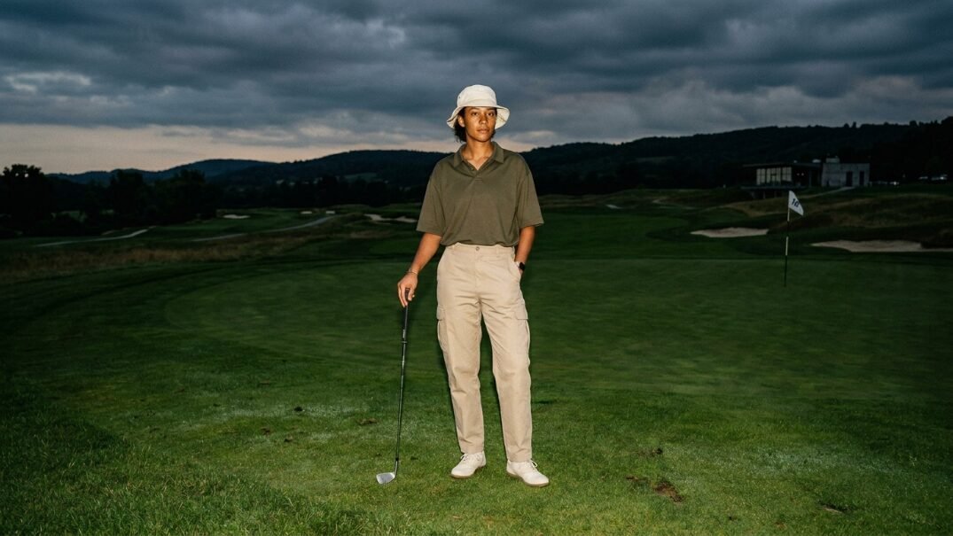
Quiet Golf takes the absolute opposite approach of loud streetwear. They use muted earth tones and heavy canvas. They utilize tiny minimalist fonts. The aesthetic feels incredibly calm and highly curated.
Stripping Away the Noise
I wore their canvas dad hat to a private club last Sunday. The branding looks so subtle that three people asked me who made it. They charge $45 for hats and $120 for heavy cotton shirts. The garments feature zero loud graphics. The golf prints feel entirely absent. They rely purely on extreme fabric quality and perfect tailoring. You feel incredibly relaxed wearing their gear.
The Power of White Space in Golf Design
Their lookbooks feature vast empty spaces. The photography uses harsh flash on film cameras. This creates an incredibly raw documentary aesthetic.
- Wear their minimalist hat with a plain heavy tee.
- Pair it with simple straight leg trousers.
- Use absolutely zero neon colors.
You look like a modern art director who happens to play golf.
Random Golf Club Inclusive Documentary Style
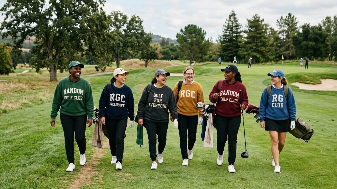
Erik Anders Lang created a brand around pure storytelling. Their clothes represent a lifestyle of playing with complete strangers. They celebrate walking the course and sharing real human moments. The aesthetic feels incredibly authentic.
The Typographic Golf Logo
The bold block letters photograph beautifully. I own their classic script crewneck. The $90 price tag feels perfectly justified by the heavy fleece lining. The golf graphic design looks perfectly balanced. The letters sit squarely on the chest. The heavy ink withstands heavy washing without cracking. You feel incredibly cozy during early morning rounds. The aesthetic fits perfectly on cool autumn days.
A Visual Identity Built on Real People
They never use professional fashion models. Their Pinterest boards show real players with messy swings and genuine smiles. The golf prints often feature hand drawn doodles.
- The clothing feels broken in immediately.
- The hats fit loosely and comfortably.
- The colors mix and match easily without thought.
You look like you truly love the pure soul of the game.
Bad Birdie Loud Prints and Party Vibes

Bad Birdie targets the weekend player who blasts music from a cart. The aesthetic feels incredibly loud and entirely unapologetic. They completely reject boring country club rules. They bring absolute party energy to the fairway.
Wild Golf Prints and Floral Patterns
I tried their flamingo print polo during a trip to Arizona. The vibrant colors absolutely pop against the dry desert backdrop. You spend $85 for a shirt that guarantees massive attention. The golf design features repeating tropical icons and bright neon splashes. You cannot hide while wearing these shirts. They demand a fun attitude and a cold drink in your hand.
Modern Athletic Fit
Despite the wild golf branding design the athletic cut remains incredibly sharp. The sleeves hug the biceps tightly. The moisture wicking material performs flawlessly in 100 degree heat.
- Pair a wild floral shirt with plain black shorts.
- Let the shirt dominate the entire outfit.
- Wear bright white shoes to complete the look.
You look ready for a massive weekend celebration.
The Core Blueprint for Your Own Golf Branding Design
If you plan to launch your own line you must study these massive success stories. The market completely saturates with cheap polyester. You must differentiate through superior aesthetics and heavy fabrics. You cannot fake true quality on camera.
Defining Your Visual Identity and Color Palette
Never use standard primary colors straight out of the box. Mix custom shades like burnt orange or faded sage green. Your golf prints must tell a cohesive story instantly. If you want a retro vibe stick to argyle and piping. If you want a modern streetwear look use bold block lettering. The consistency across your entire feed matters deeply. Your Pinterest board must look completely unified.
Creating a Timeless Aesthetic Mark
A good cup logo or crest needs to look great on a tiny hat. It must also look great on a massive billboard. Keep the golf design extremely simple. Complex illustrations blur entirely when embroidered. I tell every new designer to test their logo at a half inch scale. If it becomes unrecognizable you must simplify the lines immediately. Clean sharp lines win every single time.
Frequently Asked Questions
You likely have questions about jumping into this new aesthetic wave. I gathered the most common inquiries from various style forums and clubhouse debates. These answers will guide your next wardrobe purchase perfectly.
How do you properly style baggy retro golf pants?
You must balance the loose fit perfectly. Wear a fitted polo tucked tightly into the waist. Use a solid leather belt to define your waistline. The baggy pants drape beautifully over classic saddle shoes. Never wear a baggy shirt with baggy pants. You will look incredibly sloppy.
Are heavyweight cotton shirts comfortable in summer heat?
Yes they perform surprisingly well. Premium Pima cotton breathes naturally and pulls heat away from your body. The heavy drape keeps the fabric off your skin. Cheap polyester traps heat and sticks to your sweat. Quality heavy cotton feels incredibly crisp and cool all day long.
What makes a specific golf brand go viral on social platforms?
Aesthetic cohesion drives all viral sharing. A brand must present a distinct lifestyle. High contrast photography and rich textures catch the eye instantly. Users save images that inspire a specific mood. A flat shiny polyester shirt provides zero emotion in a photograph.
How do independent golf labels compete with massive legacy companies?
Independent labels move incredibly fast. They drop small limited collections based on current culture. Huge legacy companies take two years to design a single shirt. Small aesthetic golf brands react to streetwear culture instantly. They build deep community loyalty through authentic styling.
Why are flat brimmed hats replacing traditional baseball caps on the course?
Flat brimmed hats carry massive streetwear credibility. They completely change the silhouette of your head. The wider brim frames your face sharply. It signals that you appreciate modern culture. Traditional curved caps look overly athletic and incredibly basic.
How does film photography change the perception of golf apparel?
Film photography adds grain and deep contrast. It removes the sterile clinical look of digital sports photography. The clothes look lived in and authentic. Aesthetic golf brands use 35mm film to create pure nostalgia. The colors look richer and far more emotional.
What specific colors dominate the current golf aesthetic?
Muted earth tones and soft pastels completely dominate the market right now. Forest green mustard yellow and dusty pink look incredible on camera. Neon colors work only as tiny accents. You want colors that look naturally faded by the sun.
Do private country clubs allow streetwear inspired golf clothes?
Many private clubs recently relaxed their strict rules. A collared heavy cotton polo usually passes inspection perfectly. Baggy tailored trousers meet traditional dress codes easily. You must respect the club rules while pushing the aesthetic boundaries subtly.
How much should you reasonably spend on a quality aesthetic polo?
A true premium polo costs between $90 and $150. You pay for custom fabric milling and tight embroidery. Cheap $40 shirts lose their shape after three washes. A $120 shirt will look perfectly crisp for five full years.
Why do independent brands strictly use limited drops?
Limited drops create massive urgency. They prevent the brand from feeling overly common. When a heavy script hoodie sells out in ten minutes it builds huge hype. The clothes feel like rare collector items rather than basic athletic gear.
How do you mix modern tech shoes with vintage apparel?
You must find tech shoes with minimalist designs. A pure white modern shoe pairs nicely with vintage argyle. Avoid shoes with massive plastic logos or crazy mesh patterns. Clean lines bridge the gap between retro clothes and modern footwear perfectly.
What role does typography play in a successful golf logo?
Typography sets the entire emotional tone. A sweeping script font feels relaxed and coastal. A heavy block font feels aggressive and urban. A tiny serif font feels wealthy and traditional. The typography must match the fabric choice perfectly.
How do you wash heavyweight graphic golf shirts without fading?
Always wash them inside out on a cold gentle cycle. Never use a hot drying machine. Hang the shirts on thick wooden hangers to air dry. This perfectly preserves the thick cotton fibers and keeps the graphic ink from cracking.
Why is the 1990s aesthetic suddenly dominating fairway fashion?
The players dominating the tour today grew up in the 1990s. They feel deep nostalgia for that specific era. The baggy clothes and chunky logos remind them of their childhood heroes. The fashion cycle perfectly aligns with their current buying power.
How do you build a versatile golf capsule wardrobe from scratch?
Start with two pairs of neutral tailored trousers. Buy three heavy cotton polos in muted earth tones. Add one heavy script logo crewneck sweater. Finish with a solid unstructured dad hat. You can mix these few items endlessly for perfect outfits.
Your Next Steps for a Perfect Fairway Wardrobe
You now have the exact blueprint to completely overhaul your aesthetic. You know exactly why heavy cotton and rich typography beat cheap shiny polyester every single time. You see how labels like Malbon and Bogey Boys completely redefined the visual culture of the sport. The days of boring athletic wear are completely gone. You can step onto the first tee looking incredibly sharp and highly intentional. Do you plan to build a retro 1970s capsule or lean heavily into modern streetwear for your next weekend round?

Jenna Carter is the Senior Style Editor at Her Golf Outfit and a lifelong golfer turned certified personal stylist. With a background in retail buying for major athletic brands, she leads our brand reviews and lookbook curation, spotting the pieces worth your money and decoding country-club dress codes so you never second-guess what to wear to the clubhouse.